Waiting for the car’s oil to be changed, I started looking through the freebie local business advertising mag. This not only occupies time, but challenges my Spanish vocabulary, and having some experience in graphic design, allows me to amuse myself by mentally redesigning ads.
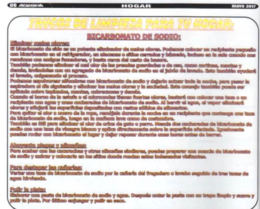
But oh, an article about baking soda — always interesting.

Unless it’s basically illegible because of garbaged-up type. And not because of low resolution or image compression—

— it really is that bad. So, OK, not I’m not going to read that article.
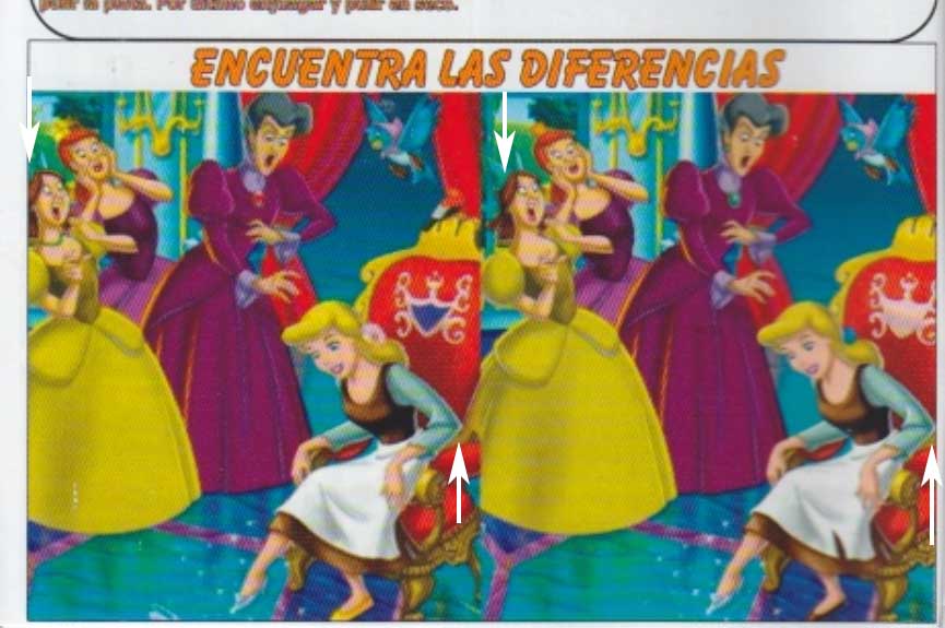
Below it on the page, a “spot the differences” image. Not my favorite, but worth a minute or two.

But immediately I am stopped by a quandary: is the fact that the two images are cropped differently meant to be one of the differences, or does it simply represent more design incompetence?
One thought on “Graphic nondesign”